Menu Close

Category: Awesome App Updates (page 1 of 1)

Read It Later Gets a Facelift and a Brand New Name: Pocket (Web, iOS, Android, Kindle Fire)

Read it Later Gets a Facelift and a Brand New Name: Pocket (Web, iOS, Android) | 40Tech

Read It Later has been one of the most popular tools of its ilk for years now, starting way back in the dark ages of 2007. Along the way, it’s found itself up against some stiff competition with apps like Instapaper, Readability and, more recently, Evernote’s Clearly, but has remained a fan favourite with over 300 connected apps and services. It’s possible that the competition was getting a bit stiff, however, because Wednesday brought about a major change: a complete re-do of the look and feel of all apps, along with a total rebrand.

Meet Pocket, Read It Later fans.

There must be something in the air or water — or maybe it’s was Big Update Month or something. Facebook pushed all of its Pages over to the new timeline feature, confusing many a marketing guru and causing some frantic thinking as to how to force people to keep liking their pages; Google continued its Google+ focused design rollout, changing the design and navigation of their social network into something more icon-driven; and Springpad dropped a bomb of a new design on its (mostly) unsuspecting userbase.

The main difference with the new Read It Later is that, while the other services have been met with responses that vary from meh to ARRRRRRGH!!!!, from what I’ve read, Pocket has been received with almost universal positivity. This is not without reason, however, as everything about Pocket is an improvement.


Look and Feel

The new look and feel is easier to navigate, and visually appealing. It kind of reminds me of the new Springpad, in some ways — but don’t worry, new Springpad haters, the icon view isn’t too huge for the design, and the list view is still there, if you don’t like it. The colors are nice, the new branding is pretty and simple, and the icons in the mobile versions are pretty much self-explanatory. It also helps that, while some views are obviously going to be different depending on the device you’re on (no grid view for iPhone for example), the interface is consistent throughout. The end result is that it is a lot easier to find your way to and through the content you’ve saved, as well as to mange it (read, unread, tags, delete).

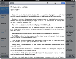
Pocket - Formerly Read It Later - for iPhone, iPad, Android, Kindle Fire

image


Functionality

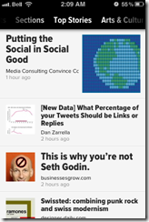
Pocket did the smart thing and didn’t remove functionality it’s users we’re used to. Instead, they added features that make the service even more useful! Pocket gets that the web is more than just words and that you want to bookmark more than just articles for later viewing. Now you can bookmark and view images and videos from all over the web right in your Pocket apps. On your computer or iPad, you the video pops up in an overlay, and on the iPhone, they open in the native video player — and in all services, you can launch them right from the little play button that appears on thy our bookmark’s thumbnail.

Info: Videos need an active internet connection, but articles and images still download for offline viewing.

Note: If you had a favourite app, extension, or bookmarklet for Read It Later, they should all still work with Pocket. You can also send to Pocket by email, and they’ve redesigned the official Google Chrome extension to get things into your list with a single click.

Pocket has some quick filters to aid in navigation (All Items, Articles Videos, and Images), as well as Home, Favorites, and Archives in the main menu. You can also use the search functionality, or navigate by tags, if you like.

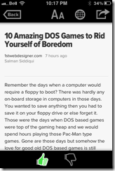
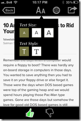
You can still toggle between the pretty read view and the native web view for an article, and it’s now a lot easier to change the look of an article. There are only two fonts to choose from (FF Yoga for serif, and Proxima Nova for sans serif), but getting to that change, as well as changing the font size, screen brightness, or from and to night reading mode now takes no more than the touch of an obvious button. No more double-tapping on your mobile screen or any other such nonsense. The menu bar is always on and doesn’t get in the way of the reading experience.


Sharing content from Pocket is easier than ever, as well. Just hit the little share arrow-button that has become the universal app symbol to pass it on, and touch to share on Twitter, Facebook, or send to Evernote. Not enough? Hit the more button and you can copy the entire article in a single click, email the link or the entire article, open it in Safari, or send it to a multitude of services (Box.com, Buffer, Google Reader, Diigo, Delicious, Pinboard, StumbleUpon, Tumblr, and all of the major social networks). Still not enough? Scroll a bit lower on iOS and you can send it on to EchoFon,Twitter for iPhone, Twittelator Pro, and even Omnifocus and Things.

That last — Omnifocus and Things — as well as the email capability, can make the things you save into actionable tasks, which is handy. And, as a nice little add on, the share services that you used most recently are the ones that will show up before the More button the next time you open it.


Downsides?

No app is perfect, and Pocket still has a few things it needs to be the best Read It Later type app out there. For one, it needs Google+ sharing and +1 capability. That was a glaring omission from the share list — though it may not be entirely their fault, as the Google+ API is still being extended. It would also be great if Pocket had the time of day activated night mode that Instapaper has, as well Instapaper’s ability to dim images as well as text. Oh — and the ability to apply night mode to the entire app would be peachy, as well. It would save more than a few eyes when users switch from an article back to the interface when reading in the dark.

Finally, I wish Pocket had some sort of reminder feature that could be applied to articles. One of the reasons I stopped using the original Read It Later — even though I loved the idea — was that the things I saved in it would never get read. They would get clipped with the bookmarklet, apps, or the Chrome extension (the new one makes this even easier), and then I would never look at them again. I actually started using Springpad to clip my articles for exactly this reason. Yes, I can send an article to my task manager to take action on, later, but only after I’ve read it — and when you see a lot of shiny things on the web or in your reader apps, your reading list can get intimidating, fast. So, yeah… Pocket, do me a solid and add a reminder function, eh?

What do you guys think of Pocket as the new Read It Later? Success? Fail? Does it trump Instapaper for you?

Get Pocket


Springpad vs Pinterest vs Evernote vs… Nobody?

Springpad 3.0 vs Pinterest vs Evernote vs... Nobody? | 40Tech

It used to be that the biggest comparison Springpad had to contend with was is it better than Evernote? Not anymore. With the newly realized vision of Springpad 3.0, the powerful and flexible digital notebook service now finds itself facing off against the hottest web service du jour: Pinterest.

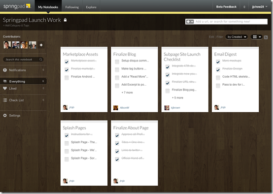
The folks at Springpad have taken something their software has always been able to do — namely, the ability to collect, organize, and share stuff you find online — prettified it and opened up the social pipelines in a big way. It’s easier to explore for new and interesting content. It’s easier to connect with people who have similar interests. But it’s also easier do something that neither Evernote nor Pinterest can provide without help: make the things that you save actionable.


Explore and Follow Interesting Public Notebooks in Springpad 3.0Use Nearly Any Smartphone, Tablet, or Computer for SpringpadNew Notebook Layout in Springpad 3.0Home Ideas Notebook in Springpad 3.0Task Management in Springpad 3.0


Jack of All Trades vs Focused Expertise

The greatest strength of Springpad is the same thing that has held it back over the years: there’s just so much — maybe too much — that you can do with it. Evernote and Pinterest, no matter how you use them or how many other services integrate them, each really do just one thing.

  • Evernote makes it easy to take notes and to search for and find them later.
  • Pinterest does visual bookmarking. End of story.

They don’t sound all that glamorous when you boil them down to their base elements, but they don’t need to. Each service does its one thing extremely well — better than everyone else, in fact. There’s power in that. Simplicity engenders trust, niche marketing, yadda yadda.

Springpad, on the other hand, can do all of the following (and more):

  • Take notes and make it easy to find them
  • Visual bookmarking (socially-focused now, just like Pinterest)
  • Personal shopping assistant (finds deals for you and such)
  • Task management (including reminders and integration with Google Calendar)
  • Collaborative planning (including corkboard-style planning for the visually inclined)
  • Etc, etc, etc

To top it off, there are several tools in Springpad that make it easy to classify and organize the various types of information you might want to collect — everything from recipes, to bookmarks, to wine and product wish lists, tasks, notes, files, and more. You can do all of these things quickly and easily from almost any smartphone or computer. They even help you to find new things that you’re interested in, use HTML 5 to give you offline access, and allow you to work with multiple people on private or public notebooks — and they do it all for free!

With all of that — and for free — Springpad should be at the top of the heap, right? Unfortunately, the reality is that their quest to become the ultimate digital notebook — which I believe they are, all things considered — creates a product that some may find intimidating. The immediate impression is that there is too much to learn, and not enough time to invest in it.


But Wait! Springpad Might Have Found the Secret Sauce…

Thankfully, the new, more visual design of Springpad 3.0 takes a lot of that intimidation factor away. The new design introduces a sort of visual simplicity that is easy on the eyes, and makes you want to click through and explore. You can even explore the public notebooks without having your own Springpad account, searching through different interest categories to find everything from great design and gift ideas to awesome places to eat in the city of Boston (or wherever).

If you’re looking for a definitive guide to Springpad, regular 40Tech commenter Daniel Gold has just released his second eBook, Springpad: Smarter Notebooks, Smarter Sharing, A Smarter Way to Get Things Done [affiliate link]. It’s 80+ pages of Springpad ins and outs for just $5.


In these different notebooks, you can find images, videos, commentary, and more — and if you get an account of your own you can “Spring” your favourites into your own public or private notebooks, add alerts for price drops, add a task or reminder to make sure you remember to look at it again, and so much more. As I said, the information becomes more than just a note or a bookmark, it becomes something you can act upon, in an ecosystem that facilitates forward movement instead of a vague list of interests or a virtual filing cabinet you may never open again.

Springpad shouldn’t be compared to Evernote or Pinterest. Not directly, anyway. It’s become an entity of its own, a place where users are interacting with trusted sources,  free to save and act on the things that matter most to them. Springpad 3.0 is a platform that can be easily adopted to suit your needs, be they a simple notebook, a place to find ideas, or a GTD task manager. It can even stand alongside of Evernote or Pinterest, should you want it to.

Go check it out. See what you think. We’d love to hear about it!


Awesome App Updates: Flipboard, Zite, PressReader (iOS)

Awesome App Updates: Flipboard, Zite, PressReader (iOS) | 40Tech

We’re always looking for a better way to filter and experience all of the content we discover on the web. Thankfully, there are a ton of great feed readers and news discovery apps out there. Three of the standouts, Flipboard, Zite (which we somehow never wrote an article on, directly), and PressReader, have recently received some significant updates. Some might even call them game-changing. Either way, they’re significant enough that we feel the need to share them with you, so read on! Enjoy! And comment, of course…  


Flipboard and Zite

When Flipboard came out, it blew people’s minds. All of your Google Reader content boiled into a pretty, personalized magazine? Awesome! Especially when you consider that it would do the same with your Twitter and Facebook feeds.

Then Zite came out. It wasn’t as flashy as Flipboard, but it had a nice, minimalist feel to it, and a fancy learning algorithm that helped it to feed you the content you would find most relevant. Aside from Feedly, which came to iOS later (but had been a web app since before the iPad existed), there was really nothing that could compare with Flipboard and Zite for stylized delivery of your favourite content. And all for free, too.

Both of these apps did what all good apps do: they kept updating. Mostly, they kept adding more ways to share content and more ways to bring new content in — everything from Tumblr to Instagram to their own suggested feeds organized by topic could be added to your magazine. Flipboard and Zite weren’t just for organizing your own content, they were discovery engines as well!

There was only one problem… with all of the updates, the one that everyone wanted never came. Where, oh where was the iPhone app? Yes, yes, Android users, I know the Android app was wanted, as well, but this is an iOS post — it says so in the title. :P

Well, the updates that people were waiting for are in and both Flipboard and Zite are now available for the iPhone. To make things cooler (and make sure that you stay engaged with their apps), Flipboard and Zite both offer a way to synchronize your feeds between devices. All you have to do is sign up for their free accounts.

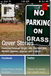
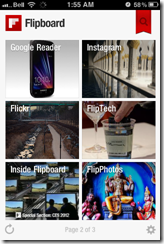
Flipboard Cover on iPhone | 40Tech  Flipboard for iPhone | 40Tech  Flipboard Article on iPhone | 40Tech

Zite for iPhone | 40Tech   Zite Article on iPhone | 40Tech   Zite Article Options on iPhone | 40Tech

If you love the look of Flipboard but wish it had the same learning ability of Zite, then you’ll be happy to hear that the iPhone version does do something very similar. The iPad should get that feature soon. Zite still has a slight edge for massive content consumers, however — or for shared iOS devices. The app allows for multiple accounts, which makes it easy to set up and switch between magazines for work, pleasure, news, food, different people; you name it.

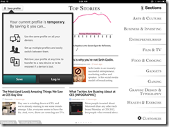
Sync Flipboard to iPhone, iPad | 40Tech  Sync Zite to iPhone, iPad, with Multiple Profiles | 40Tech


PressReader (by NewspaperDirect)

I love PressReader simply because it is a fantastic use of technology. It allows people to experience their local newspaper — and newspapers from all over the world — right on their iPhone or iPad (it’s on Android and the web as well). It’s fantastic. People who aren’t ready to part from their traditional means of reading the news can still have it. In many ways, the experience is enhanced, as well; most especially with the sharing features of the app, and the text-to-speech capability that allows your iPhone or iPad to read your paper to you on the go.

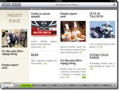
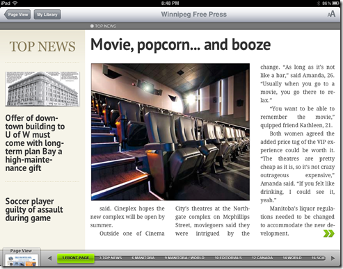
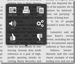
PressReader’s most recent update not only brings the app up to date with iOS 5, but it also adds a bevy of new features that make the experience even better. The most notable is the (iPad only) SmartFlow technology that visually optimizes the newspaper for the iPad, much in the same way that Flipboard and Zite prettify content feeds. This feature can be turned on and off in settings, and enabled per article and page from the nifty new press and hold menu. It’s a bit intense for the first generation iPad, so it is off by default. I found it worked well enough with mine, though, with only the occasional crash.

PressReader Smartflow | 40TechPressReader Before SmartFlow | 40TechPressReader After Smartflow | 40Tech

PressReader has also added push notifications so that you can know right away when the latest version of your favourite paper is out. It’s like it’s got a built in paperboy — or maybe paperperson?

Finally, the added ability to copy and paste articles directly into note taking applications is a nice touch for those of us who use Evernote and friends (see: Us).

PressReader Press, Hold Menu | 40Tech  PressReader Article Copied to Evernote | 40Tech


I’m loving the updates to PressReader, Flipboard, and Zite. They are, in a word, Awesome. I think you should get them and you should love them. If you are using a first generation iPhone or iPod Touch, though, don’t get the PressReader update. Your tech will not like you.

What are your thoughts on these recent Awesome App Updates?