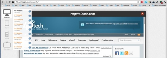
If you run a website, you’ve probably run into issues trying to figure out what your site looks like on various devices. If you want a quick way to figure it out, check out Screenfly, a site that lets you see how your site appears on different devices, including desktop, tablet, mobile, and even television. Within each of those categories, you can choose from a variety of devices. For example, if you choose tablet, you can pick between the iPad and four other tablets, including the Motorolla Xoom. Even the desktop selection allows you to choose between several screen resolutions.
Do you have other methods for seeing how your site looks on different platforms? If so, share your tips in the comments.
Screenfly [via One Thing Well, as shared by Steve Rubel on Google+]
Amit says:
Looks like a great tool, but does it also render the page like those devices? My main problem is not screen resolution, but how the browsers render the website.
July 27, 2011 — 1:55 am
Evan Kline says:
It seems to with mobile devices only, Amit. With the desktop, you’re only given the choice to view in different resolutions. The Safari icon is displayed, so I assume that is what it being displayed.
July 27, 2011 — 9:24 am
Amit says:
That’s exactly what i needed. Most visits come from computers or laptops, you can’t modify your website for a 320×250 screen phone, but you can at lest try.
July 29, 2011 — 12:06 pm
Sam says:
Is so cool! I just go to Screenfly to see how my website looks on mobile device’s, i was so curios to see how it look on the iPhone 4. Results are not so good, i have to check it out.
July 27, 2011 — 4:54 pm
Cristian Balau says:
I only care how my websites look and act on Firefox, Chrome, IE, Opera, Safari, Android and Apple. I can easily check all of them.
Since that 99% of the internet traffic I could care less for the rest.
July 28, 2011 — 1:11 pm
karan says:
Really cool. I will try this right now. Thanks
July 28, 2011 — 1:27 pm
Maria says:
Well this tool should come in handy soon :) Perfect for webmasters who just don’t have the hardware to test their page on different monitors and resolutions.
August 2, 2011 — 6:11 am
Elaine says:
Tried it, but even though we have a wordpress plugin to automatically detect mobile devices, the site still looked as it normally would on a computer.
April 4, 2012 — 3:52 am
George says:
Hi,
But what you think about using a plugin for wordpress platform ?
May 15, 2012 — 6:12 am
Andrew Newey says:
Thanks for the share Evan. Really quick and easy tool to compare all platforms! Perfect.
October 23, 2012 — 11:22 pm
Robert Thompson (@RT1959) says:
I have made my website mobile on dudamobile.com It looks and works fine on their site. http://www.rt1959.com/
October 29, 2013 — 2:22 am